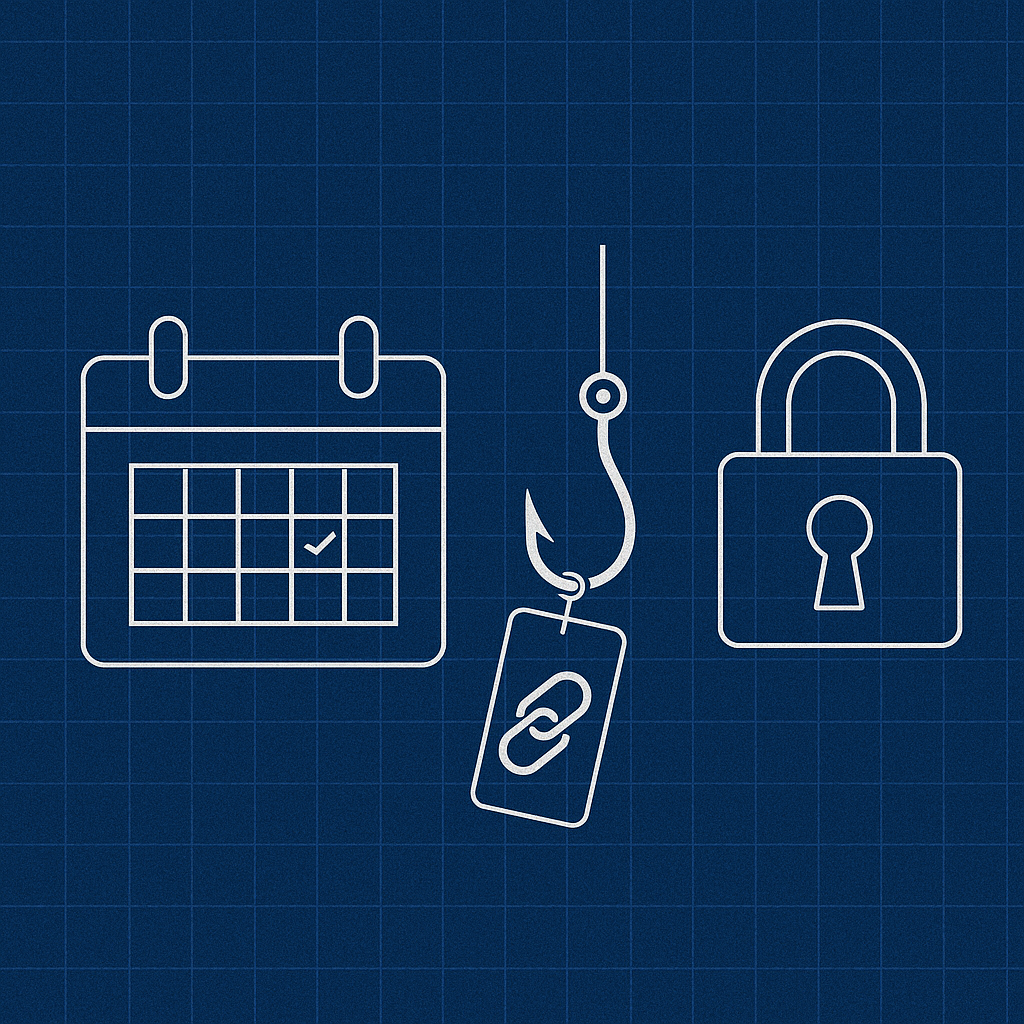
A single rogue calendar invite can undo months of brand trust. One moment a client accepts a booking confirmation; the next, a credential farm harvests passwords behind a pasted-on logo. The threat hides in plain sight, blending with routine notifications that everyone dismisses as harmless housekeeping.
This blueprint dissects the typical invite flow, highlights the most abused cavities, and lays out concrete countermeasures—signed links, fleeting tokens, and visual handshakes—that choke an attacker’s window of opportunity without strangling user experience. Follow each step and the humble “Add to calendar” button transforms from soft target to locked gateway.
Danger Lurking in Calendar Invites
Calendar confirmations glide past most security filters because they travel through trusted systems and drop themselves directly into personal schedules. Once installed, the invite behaves like a VIP pass: automatically synced, rarely inspected, and capable of carrying hidden payloads. Reports of spam invites creeping into Google Calendar illustrate how a single loophole floods entire schedules with malicious events.
Picture a bustling port at dawn. Containers (events) roll off ships, customs officers (email gateways) glance at the manifest, and trucks whisk cargo inland. Slip one extra crate onto the dock and it journeys forward unquestioned. In a similar fashion, three overlooked fields inside every invite routinely act as smuggling compartments:
- RSVP buttons that redirect participants to a URL the sender controls.
- Location fields, displayed prominently in mobile notifications yet rarely parsed for threats.
- Attachments labeled “Agenda” or “Slides” that mask embedded scripts or malicious macros.
Because the message carries legitimate branding and originates from a domain recipients already recognize, users click reflexively. Familiarity acts like camouflage, converting harmless metadata into a stealth channel. Recognizing these weak seams is the first step toward sealing them.
Anatomy of a Compromised Booking Flow
When an email is weaponized, the journey from inbox to exploit unfolds in seconds. Attackers often begin with a homograph or typo-squatted domain that resembles the real thing—swapping two adjacent letters, adding an extra consonant, or leveraging visually identical Unicode characters. Such homograph typosquatting tactics continue to bankroll campaigns by capitalizing on snap judgments in crowded inboxes.
A short-link service then compresses the counterfeit URL, masking the deception on both desktop and mobile. Security analysts warn that QR code scams fuel the rise in quishing, converting a single glance into a full credential handoff.
As soon as a recipient selects “View meeting details,” the short link expands and forwards traffic to a pixel-perfect clone of the official booking page. Cascading style sheets, images, and copy are scraped from the legitimate site, so the impostor feels authentic. The credential form posts captured usernames and passwords to an off-shore server and quietly issues a 302 redirect to the genuine confirmation page. Victims believe nothing went awry; the attacker pockets a working login and vanishes.
Mapping the flow reveals three decisive choke points where defenses yield maximum payback: the initial click, the redirect handshake, and the final confirmation screen. Guard those junctures and the majority of quishing campaigns collapse under their own weight.
Building a Trust Fabric: Signed URLs and Short-Lived Tokens
First, impose an expiration date on every hyperlink. Attach a JSON Web Token signed with a rotating secret; if the timestamp eclipses 30 minutes or the query string mutates, the server answers with a calm “Link expired” page. Reducing the lifespan from “indefinite” to “half an hour” narrows the attacker’s window to an inconvenient flicker. Protocol guides note that short-lived access tokens boost web security precisely by shutting the door on replay attempts.
Second, introduce a dynamic visual seal. Borrow a trick from public-transport tickets: each morning the server selects one of six color palettes and renders it as a slim banner across the page. Recipients learn to glance for today’s hues—perhaps lilac and charcoal on Monday, tangerine and navy on Tuesday. A static phishing clone cannot guess the daily combination without continuous reconnaissance, raising the cost of forgery considerably.
Even with these safeguards, load time rises by roughly three seconds. Frame the pause as deliberate by displaying a short line—“Verifying secure link…”—so users interpret the delay as protective rather than sluggish. After implementation, a barrage of 10,000 fuzzed URLs (expired tokens, malformed parameters, missing signatures) produced a flawless stream of HTTP 410 responses and zero server strain.
The strategy directly counters a growing threat class known as quishing, where QR codes or abbreviated links funnel viewers to credential traps. By pairing signed links with fleeting life spans, the lure withers before it can reel in a victim.
A quick detour helps clarify the change from another angle. Fire 10,000 mutated links—expired timestamps, mangled parameters, blank signatures—at the endpoint, and each one returns the same quiet refusal. No crashes, no memory spikes, just a server standing its ground.
Visual Cues That Real People Notice
Security icons nestled in the browser chrome earn little attention; a bright banner inside the content frame commands it instantly. An eye-tracking test with twenty volunteers compared three booking pages: one sporting the daily color seal, another packed with legal disclaimers, and a third relying solely on HTTPS indicators. Eighty-five percent of gaze fixations landed on the banner within a second. The legalese section barely registered; the padlock icon ranked last, eclipsed by a stray emoji added as a control.
The findings reinforce a simple principle: clarity outperforms complexity. Users gravitate toward bold, dynamic signals and ignore static walls of text. When the color banner migrated to the top of the layout, help-desk tickets labeled “Is this really you?” dwindled to zero within a month. Security that feels like design rather than detention fosters confidence without demanding extra effort.
Analogies help crystallize the lesson. The banner functions like a lighthouse—bright, unmistakable, and refreshed with each tide—guiding ships away from hidden shoals. Shield users with that beam, and they navigate dangerous waters instinctively.
Measuring the Fix: KPIs That Matter
Hard evidence validates any security upgrade. Four key metrics reveal whether new safeguards hinder or enhance engagement:
- Verification latency in milliseconds.
- Completed booking rate as a percentage of initiated sessions.
- Support tickets tagged “suspicious link.”
- Repeat engagement within thirty days.
Baseline readings prior to reinforcement averaged 1.1 seconds of load time, a 62 percent completion rate, forty-one skeptical tickets per month, and 23 percent repeat visits. Three months after deployment, latency settled at 4.3 seconds—slightly above the industry comfort threshold yet still acceptable. Completion climbed to 66.7 percent, support tickets dropped to zero, and repeat engagement rose to 28 percent. Industry guidance on metrics that truly measure security success recommends focusing on such behavioral indicators rather than vanity numbers, underscoring the value of these gains.
The figures underscore a counterintuitive truth: visible security can amplify conversions. Customers interpret deliberate safety checks as professionalism, rewarding the effort with loyalty rather than abandonment.
Lessons Learned and Immediate Next Steps
Habit, not hardware, often poses the largest risk. Automatic acceptance of familiar invitations breeds complacency, and attackers feast on muscle memory. Break that cycle by scheduling quarterly “red-team drills” where a colleague or consultant attempts to breach the invite flow. Any route cracked in under ten minutes flags an urgent patch.
Continuous secret rotation further frustrates would-be impersonators. Automate the process with a nightly cron job, store keys in a hardened vault service, and alert on any failed verification. Noise discipline matters: the alert channel must remain quiet enough that a single anomaly sparks attention.
Education rounds out the defense. Rather than burying users under dense policies, repeat one concise cue—“Check today’s banner colors.” Humans process shape and hue faster than text, so instinct becomes an ally. Pair that cue with the automated safeguards above, and the humble calendar invite evolves from a soft underbelly into a hardened gateway.
Conclusion
Trust functions as the currency of digital appointments, and its value plummets when invitations wander unchecked. Short-lived tokens, rotating secrets, and vibrant visual seals forge a chain of custody that attackers struggle to fake. Users need not understand the cryptography; they simply experience a flow that feels both familiar and unmistakably guarded.
Adopt this blueprint as a living framework. Adapt each element to local architecture, revisit the assumptions every quarter, and refine the signals users see. Security never stands still, yet every tightened link in the chain narrows the arena in which deception can thrive.


